Emmanuel Aina
Emmanuel Aina  ·  Email Designer  ·  Ibadan, Nigeria

Designs
ByOlly

I design email campaigns that convert, retain, and resonate — for DTC brands, agencies, and media companies that refuse to be ignored in the inbox.
Email Design DTC Brands Dark Mode Ready Klaviyo · Mailchimp Mobile First Welcome Flows Flash Sales Cart Abandonment Product Launches 20+ Emails Designed 5 Brand Verticals Psychology-Led Email Design DTC Brands Dark Mode Ready Klaviyo · Mailchimp Mobile First Welcome Flows Flash Sales Cart Abandonment Product Launches 20+ Emails Designed 5 Brand Verticals Psychology-Led

Built for brands
that mean business

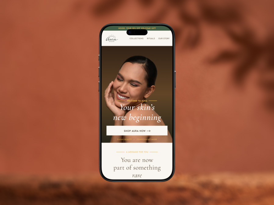
Aura Skincare — Email 01: Welcome & Convert
Tap to view full email
Beauty & Wellness · Welcome Flow
Aura Skincare — Email 01: Welcome & Convert
Beauty & Wellness · Welcome Flow
Aura Skincare — Email 01: Welcome & Convert
The brief

The first email in a 3-part welcome flow for a clean beauty DTC brand. Goal: convert the new subscriber with a welcome discount while establishing brand trust from the very first interaction.

Design decisions
  • Led with editorial hero image and large italic serif headline to signal premium positioning immediately
  • Promo code presented as a gift in a bordered box — ceremonial rather than transactional
  • Shipping and returns handled early to remove purchase friction before it arises
  • Carbon neutral delivery in the footer reinforces sustainability values subtly
The execution

Mobile-first at 600px. Every section background explicitly declared for dark mode. Two-column desktop layout with offer embedded in the hero right column.
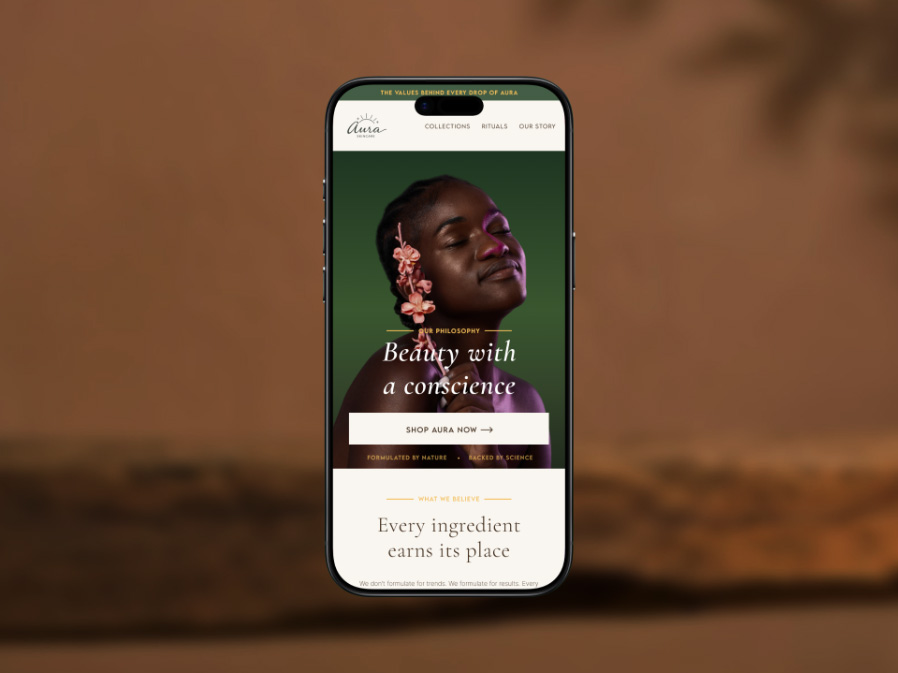
Aura Skincare — Email 02: Build Trust
Tap to view full email
Beauty & Wellness · Brand Values
Aura Skincare — Email 02: Build Trust
Beauty & Wellness · Brand Values
Aura Skincare — Email 02: Build Trust
The brief

Second email in the welcome flow. Goal shifts from conversion to belief-building — earning long-term loyalty by communicating what the brand stands for, not what it sells.

Design decisions
  • Roman numeral pillars (I, II, III) replace generic icon rows — feels editorial, not template
  • Founder quote in large italic serif gives the brand a human voice at a critical trust moment
  • Deep forest green hero connects to sustainability positioning visually
  • GLOW10 reminder in a dark closing section — present without being pushy
The execution

Consistent design system across all three Aura emails. Type hierarchy, gold accent, and warm neutral palette maintained precisely throughout the flow.
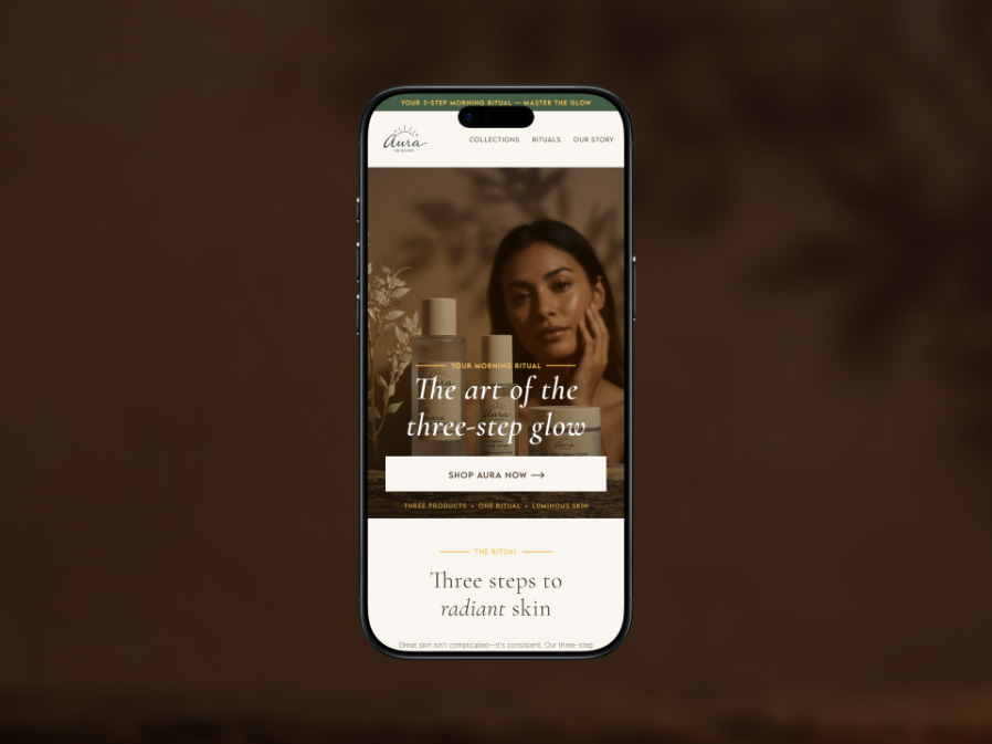
Aura Skincare — Email 03: Drive Retention
Tap to view full email
Beauty & Wellness · Ritual Education
Aura Skincare — Email 03: Drive Retention
Beauty & Wellness · Ritual Education
Aura Skincare — Email 03: Drive Retention
The brief

Final email in the welcome flow. Goal: transform a first-time buyer into a habitual user by teaching the 3-step ritual and anchoring the products as a daily practice.

Design decisions
  • Numbered steps with vertical connector line — mirrors editorial magazine layouts
  • Each step tagged (The Foundation / The Treatment / The Seal) — ritual identity beyond function
  • Two customer reviews shown, not six — credibility without scrolling fatigue
  • Deep forest green closing with gold CTA — signals action by contrast
The execution

Three emails form a complete strategic arc: convert, trust, retain. Each does one job completely.
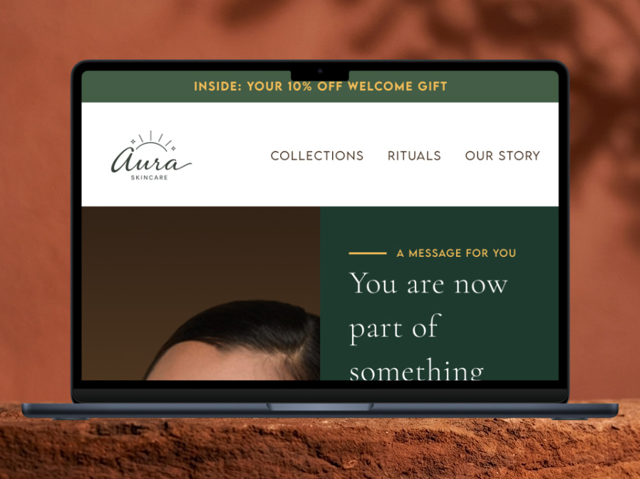
Aura Skincare — Email 01 Desktop: Responsive Rebuild
Tap to view full email
Beauty & Wellness · Desktop Layout
Aura Skincare — Email 01 Desktop: Responsive Rebuild
Beauty & Wellness · Desktop Layout
Aura Skincare — Email 01 Desktop: Responsive Rebuild
The brief

Desktop version of Email 01, rebuilt as a genuine two-column layout — not a stretched mobile. Demonstrates responsive email design thinking across both viewports.

Design decisions
  • Hero splits photography left, offer right — both columns share equal visual weight
  • Promo code embedded in dark green right column below the headline — offer in eyeline on arrival
  • Delivery promise becomes a 3-column horizontal strip at 680px
  • CTA buttons max-width 260px — buttons, not banners
The execution

Not stretched from mobile. Redesigned for the format. That distinction separates email design from email layout.

Raptor Athletics — Velocity Pro Runner Launch
Tap to view full email
Athletic DTC · Product Launch
Raptor Athletics — Velocity Pro Runner Launch
Athletic DTC · Product Launch
Raptor Athletics — Velocity Pro Runner Launch
The brief

New product drop email for a performance athletics brand introducing their flagship running shoe. Brief: build launch excitement, communicate technical specs, drive first-day sales.

Design decisions
  • Cinematic hero with full-bleed photography and aggressive headline hierarchy — energy matches the product
  • Feature list uses icon + bold title + one-line descriptor — scannable at speed on mobile
  • 238G / 6MM / HYBRID stat bar as a three-column data strip — technical credibility without heavy copy
  • Closing CTA doubles as urgency: “Don’t miss the drop”
The execution

Dark mode native — built on near-black, not retrofitted. Every section background explicitly declared. Zero rendering gaps.
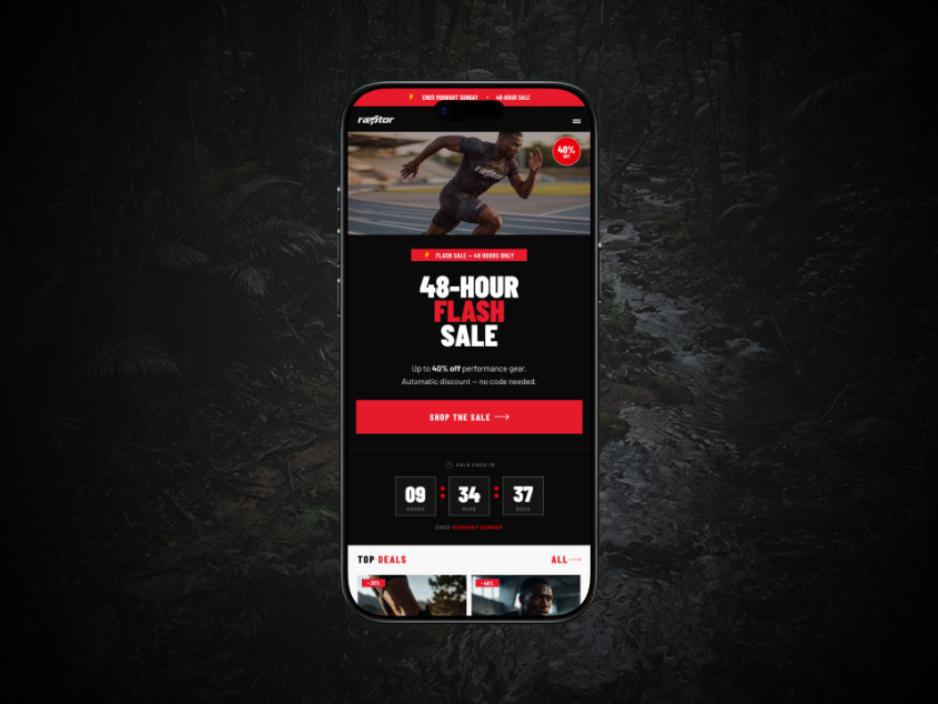
Raptor Athletics — 48-Hour Flash Sale (Mobile)
Tap to view full email
Athletic DTC · Flash Sale · Mobile
Raptor Athletics — 48-Hour Flash Sale (Mobile)
Athletic DTC · Flash Sale · Mobile
Raptor Athletics — 48-Hour Flash Sale (Mobile)
The brief

High-urgency 48-hour flash sale. Goal: maximise purchases within a fixed window using every available conversion lever — urgency, scarcity, social proof, frictionless CTA.

Design decisions
  • Countdown timer between hero and product grid — urgency without interrupting purchase flow
  • Announcement bar layers three info pieces at minimal height
  • Four-column product grid maximises product exposure above the fold
  • Social proof bar placed before closing CTA to handle last-mile hesitation
The execution

Urgency architecture is structural, not decorative. Every section has a conversion job.

Raptor Athletics — 48-Hour Flash Sale (Desktop)
Tap to view full email
Athletic DTC · Flash Sale · Desktop
Raptor Athletics — 48-Hour Flash Sale (Desktop)
Athletic DTC · Flash Sale · Desktop
Raptor Athletics — 48-Hour Flash Sale (Desktop)
The brief

Desktop rebuild of the Flash Sale. A complete layout rethink for the wider format — not the mobile version at 680px.

Design decisions
  • Hero: text-command left, full-bleed athlete photography right — both halves earn their space
  • Four-column product grid replaces stacked mobile cards
  • Countdown timer stays full-width as a horizontal transition strip
  • Announcement bar holds three info units with a pill badge
The execution

Desktop email design is not about making things bigger. It is about rethinking the layout entirely.
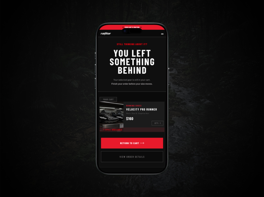
Raptor Athletics — Cart Recovery Email
Tap to view full email
Athletic DTC · Cart Abandonment
Raptor Athletics — Cart Recovery Email
Athletic DTC · Cart Abandonment
Raptor Athletics — Cart Recovery Email
The brief

Behavioural trigger email for customers who abandoned the Velocity Pro Runner. Goal: recover the purchase through product recall, scarcity psychology, and trust signal placement.

Design decisions
  • Dark background creates visual contrast — interrupts the inbox scan pattern before a word is read
  • “You Left Something Behind” — personal without being guilt-driven
  • “Still Available” badge uses availability scarcity effectively
  • Trust icons placed directly before the CTA — final objection removal at the decision moment
The execution

Every design decision serves a single conversion psychology principle. Nothing decorative, everything purposeful.
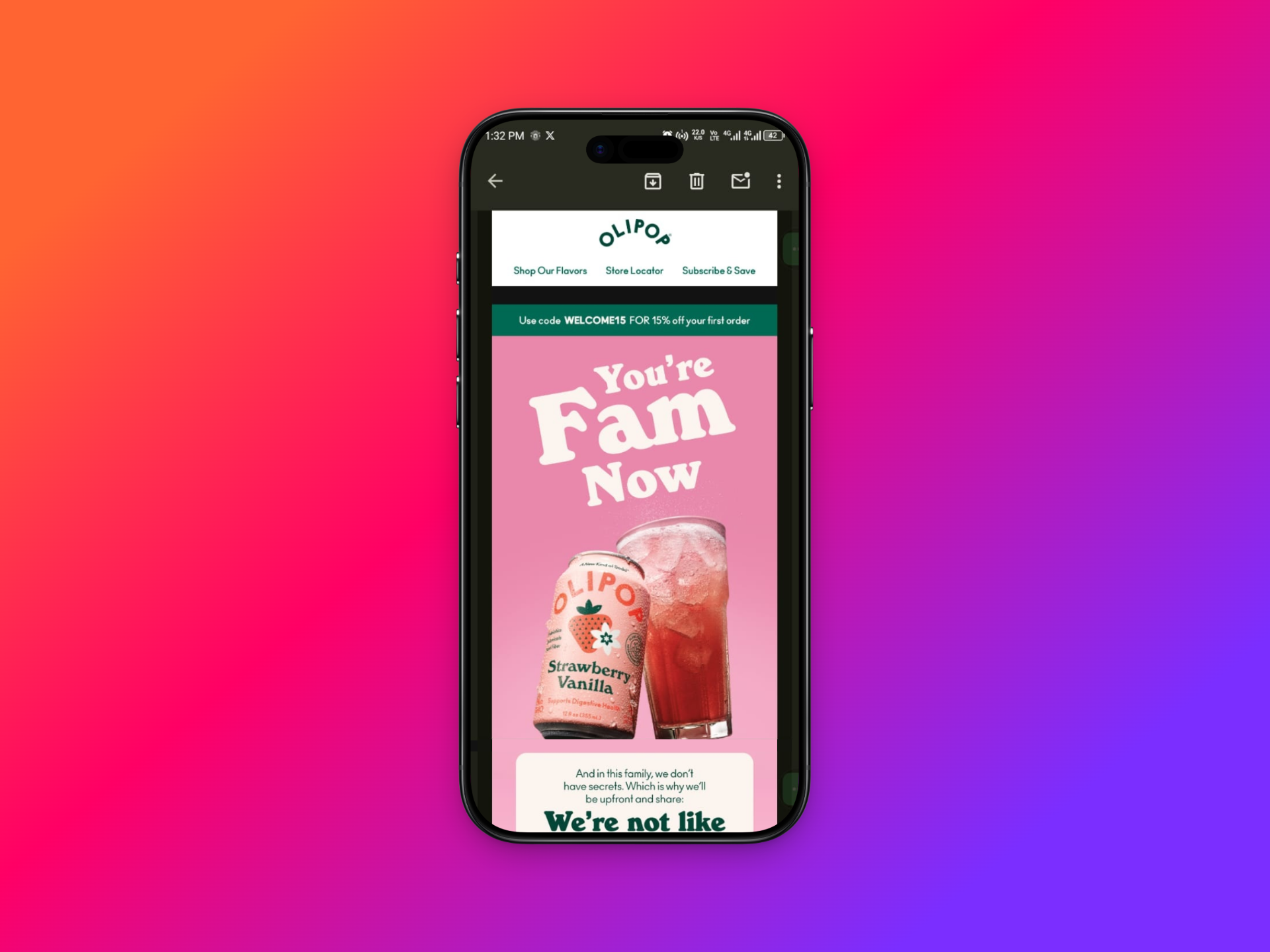
OLIPOP — Dark Mode Rendering Gaps (Before)
Tap to view full email
Beverage DTC · Cold Audit · Before
OLIPOP — Dark Mode Rendering Gaps (Before)
Beverage DTC · Cold Audit · Before
OLIPOP — Dark Mode Rendering Gaps (Before)
The brief

After subscribing to OLIPOP’s email list, a systematic dark mode rendering failure was identified across their entire email programme — a structural ESP build problem affecting every send.

Design decisions
  • Black gaps between every section on dark mode devices — affecting ~80% of mobile opens
  • Root cause: no explicit background colours declared on section containers or spacer rows
  • Issue spans multiple email types — welcome, promotional, product emails all affected
  • Brands with strong visual identity suffer the most visible damage from this failure
The execution

This is the “before” that makes the “after” the pitch. Problem identified, documented, and presented as a cold audit with a ready-built solution.
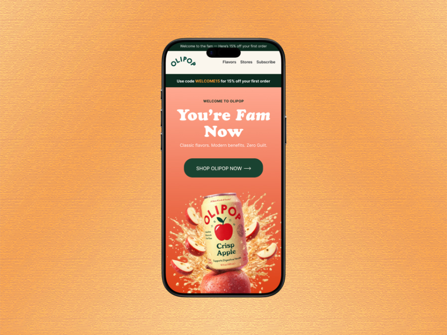
OLIPOP — Welcome Email Redesign (After)
Tap to view full email
Beverage DTC · Cold Audit · Full Redesign
OLIPOP — Welcome Email Redesign (After)
Beverage DTC · Cold Audit · Full Redesign
OLIPOP — Welcome Email Redesign (After)
The brief

Full redesign of OLIPOP’s welcome email — solving the dark mode rendering problem while elevating the design to match the brand’s premium visual identity.

Design decisions
  • Every section background explicitly declared — zero transparent rows, zero gaps in any mode
  • Flavour card system redesigned for consistency — same proportions, treatment, and buttons across all cards
  • “You’re Fam Now” headline preserved — brand voice intact, layout elevated
  • Ingredients section on dark green creates contrast moment that signals real brand substance
The execution

Tested on dark canvas in Figma. Zero rendering gaps. Solves a technical problem and delivers a stronger brand experience simultaneously.
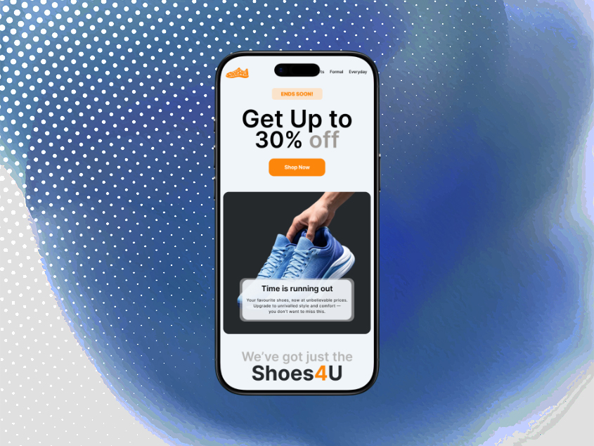
Shoes4U — Season Sale Campaign
Tap to view full email
Retail · Promotional Sale
Shoes4U — Season Sale Campaign
Retail · Promotional Sale
Shoes4U — Season Sale Campaign
The brief

Promotional email for a multi-category footwear retailer. Goal: drive purchases across shoe categories while building brand distinction in a crowded retail inbox.

Design decisions
  • Light blue and deep grey palette differentiates from red-heavy retail email norms — brand distinction at inbox level
  • Product grid with strikethrough pricing creates immediate value perception
  • Category image blocks below featured products expand discovery — designed to increase AOV
  • “Ends Soon” signal present but not dominant — brand confidence over desperation
The execution

Retail email design is about making the discount feel inevitable, not aggressive.
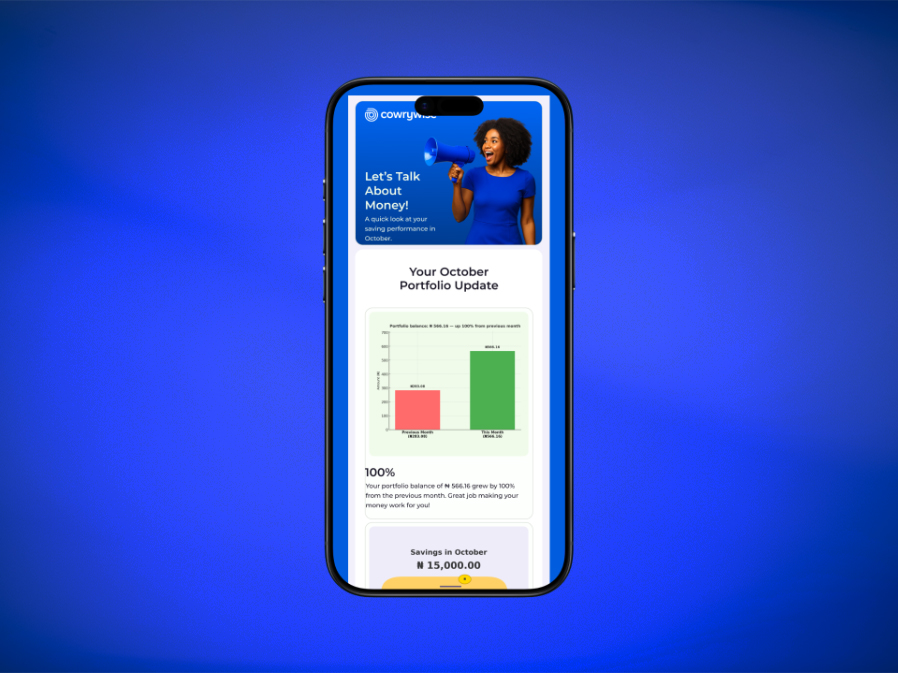
Cowrywise — October Portfolio Update
Tap to view full email
Fintech · Monthly Report
Cowrywise — October Portfolio Update
Fintech · Monthly Report
Cowrywise — October Portfolio Update
The brief

Monthly portfolio performance email for a Nigerian fintech savings platform. Goal: present data clearly, motivate continued saving, and surface actionable next steps.

Design decisions
  • Bar chart section celebrates growth visually — headline percentage front and centre
  • Three data modules structured for scanability not density
  • Recommendations use specific labelled CTAs — each has a clear action, not a generic “learn more”
  • Brand blue with white card backgrounds — trustworthy and institutional without being cold
The execution

Fintech email design requires a different visual language — trust signals replace urgency signals, data clarity replaces product imagery.
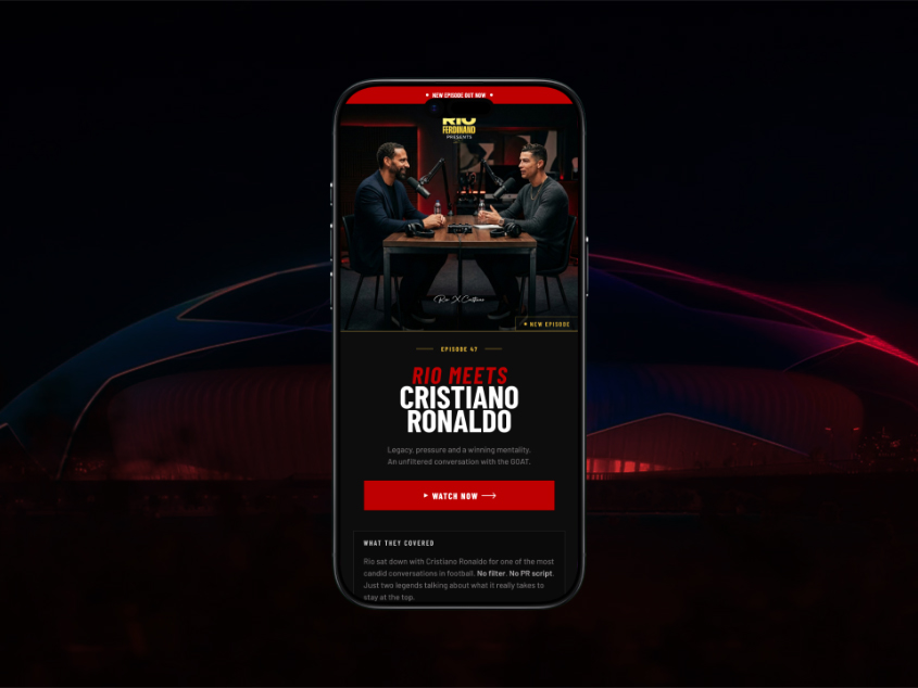
Rio Ferdinand Presents — Rio Meets Cristiano Ronaldo
Tap to view full email
Media · Episode Announcement
Rio Ferdinand Presents — Rio Meets Cristiano Ronaldo
Media · Episode Announcement
Rio Ferdinand Presents — Rio Meets Cristiano Ronaldo
The brief

Episode announcement for one of the most-anticipated football interviews of the year. Goal: drive multi-platform views and listens across YouTube, Spotify, and podcast platforms.

Design decisions
  • Bold editorial hero with episode photography — the image sells, the copy confirms context
  • Key moments numbered list gives scroll-past readers a reason to click anyway
  • Four-platform grid designed as consistent branded tiles — no preferred platform, all equal
  • Social proof stats (2.3M views / TOP 10 / 68K likes) as credibility strip before closing CTA
The execution

Media email design is editorial design. The hierarchy mirrors a magazine cover: image first, headline second, details third, action last.

Emmanuel Aina

Craft meets
strategy

I’m Emmanuel Aina — a specialist email designer operating as DesignsByOlly, based in Ibadan, Nigeria and working asynchronously with brands across every timezone.

I bring five years of graphic design experience — spanning local and international brands — into a focused email design practice. A psychology degree informs every design decision I make: consumer behaviour, decision-making psychology, and what actually motivates people to act.

Remote-first and async-ready by default. Zero timezone friction, reliable delivery, clear communication — regardless of where you’re based.

Email DesignFigmaDark Mode KlaviyoMailchimpOmnisend Consumer PsychologyBrand SystemsModule Libraries
Toolbox
◆ Figma ◆ Photoshop ◆ Canva
Book a free call →

What I
offer

01
Welcome & Onboarding Flows

Convert first, build trust second, drive the repeat purchase third. Fully async from brief to delivery.

From $600 · 3-email flow
02
Promotional & Flash Sales

High-urgency emails with countdown timers, product grids, and scarcity signals. Mobile and desktop.

From $250 · per email
03
Product Launches

Cinematic, brand-forward launch emails. Hero-led, feature-deep, CTA-sharp.

From $300 · per email
04
Cart & Browse Abandonment

Conversion psychology in every section — product recall, scarcity, trust signals.

From $250 · per email
05
Dark Mode Audits & Rebuilds

Full programme audit, systematic rebuild, zero gaps guaranteed.

From $150 · audit
06
Monthly Retainer

4–6 emails per month. Async-first, priority access, lower per-email rate.

From $1,200 · per month

How I
work

Step one
Discovery

Understanding your brand, audience, and goal before a single frame is opened. Async via brief form.

Step two
Audit

Reviewing existing emails and brand guidelines to find what works, what doesn’t, and where to go.

Step three
Design

Building in Figma — mobile first, dark mode ready, one clear action per email.

Step four
Refine

Two rounds of async revisions as standard. No calls required unless you want them.

Step five
Deliver

Figma source, exported assets, ESP-ready guidance. On time, every time.

What clients
say

Emmanuel has a rare combination of creative talent and genuine warmth that makes the whole process feel effortless. The quality of his work is immediately obvious — thoughtful, polished, and always on-brand. Truly a pleasure to work with.

TO
Toluwani Ojo
Design collaborator
★★★★★

Working with Emmanuel changed how we think about email. He doesn’t just design something that looks good — he asks the right questions and delivers work you’re genuinely proud to send.

AO
Anthony Oludele
Brand manager
★★★★★

Common
questions

What exactly do you design?+
Email campaigns of all types — welcome flows, product launches, flash sales, cart abandonment, newsletters, and re-engagement sequences. If it lands in an inbox, I can design it.
Do you write the copy too?+
My focus is design, but I can work with your copy or refine basic copy as part of the brief.
What do you need to get started?+
Brand guidelines, existing email examples, copy, your ESP platform, and your deadline. I send a simple async brief form on day one.
Which platforms do you design for?+
All major ESPs — Klaviyo, Mailchimp, HubSpot, Omnisend, and others. I deliver Figma files plus export-ready assets.
How long does a project take?+
Single email: 3–5 business days. Welcome flow of 3 emails: 7–10 days. Rush turnarounds available.
How many revisions do I get?+
Two full async rounds included as standard. Additional rounds available at a small fee.
What’s your pricing?+
Single email from $250. Welcome flows from $600. Monthly retainers from $1,200. Dark mode audits from $150.
Where are you based?+
Ibadan, Nigeria (UTC/GMT+1). Remote-first and async-optimised — I work with brands globally with zero timezone friction.

Let’s make
something
remarkable.

Currently accepting new remote projects globally. Async-first, no pressure.

BasedIbadan, Nigeria · UTC/GMT+1
RemoteFully remote & async-friendly — zero timezone friction
Emmanuel Aina  ·  Email Designer  ·  Ibadan, Nigeria

Designs
ByOlly

I design email campaigns that convert, retain, and resonate — for DTC brands, agencies, and media companies that refuse to be ignored in the inbox.

Scroll to explore
Emmanuel Aina
Email Design DTC Brands Dark Mode Ready Klaviyo · Mailchimp Mobile First Welcome Flows Flash Sales Cart Abandonment Product Launches 20+ Emails Designed 5 Brand Verticals Psychology-Led Email Design DTC Brands Dark Mode Ready Klaviyo · Mailchimp Mobile First Welcome Flows Flash Sales Cart Abandonment Product Launches 20+ Emails Designed 5 Brand Verticals Psychology-Led

Built for brands
that mean business

Five verticals. Thirteen emails. One consistent standard — mobile-first, dark mode ready, conversion-focused.

Aura Skincare — Email 01: Welcome & Convert
Beauty & Wellness · Welcome Flow
Aura Skincare — Email 01: Welcome & Convert
Aura SkincareWelcome Flow
Beauty & Wellness · Welcome Flow
Aura Skincare — Email 01: Welcome & Convert
The brief

The first email in a 3-part welcome flow for a clean beauty DTC brand. Goal: convert the new subscriber with a welcome discount while establishing brand trust from the very first interaction.

Design decisions
  • Led with editorial hero image and large italic serif headline to signal premium positioning immediately
  • Promo code presented as a gift in a bordered box — ceremonial rather than transactional
  • Shipping and returns handled early to remove purchase friction before it arises
  • Carbon neutral delivery in the footer reinforces sustainability values subtly
The execution

Mobile-first at 600px. Every section background explicitly declared for dark mode. Two-column desktop layout with offer embedded in the hero right column.

Aura Skincare — Email 02: Build Trust
Beauty & Wellness · Brand Values
Aura Skincare — Email 02: Build Trust
Aura SkincareBrand Values
Beauty & Wellness · Brand Values
Aura Skincare — Email 02: Build Trust
The brief

Second email in the welcome flow. Goal shifts from conversion to belief-building — earning long-term loyalty by communicating what the brand stands for, not what it sells.

Design decisions
  • Roman numeral pillars (I, II, III) replace generic icon rows — feels editorial, not template
  • Founder quote in large italic serif gives the brand a human voice at a critical trust moment
  • Deep forest green hero connects to sustainability positioning visually
  • GLOW10 reminder in a dark closing section — present without being pushy
The execution

Consistent design system across all three Aura emails. Type hierarchy, gold accent, and warm neutral palette maintained precisely throughout the flow.

Aura Skincare — Email 03: Drive Retention
Beauty & Wellness · Ritual Education
Aura Skincare — Email 03: Drive Retention
Aura SkincareRitual Education
Beauty & Wellness · Ritual Education
Aura Skincare — Email 03: Drive Retention
The brief

Final email in the welcome flow. Goal: transform a first-time buyer into a habitual user by teaching the 3-step ritual and anchoring the products as a daily practice.

Design decisions
  • Numbered steps with vertical connector line — mirrors editorial magazine layouts
  • Each step tagged (The Foundation / The Treatment / The Seal) — ritual identity beyond function
  • Two customer reviews shown, not six — credibility without scrolling fatigue
  • Deep forest green closing with gold CTA — signals action by contrast
The execution

Three emails form a complete strategic arc: convert, trust, retain. Each does one job completely.

Aura Skincare — Email 01 Desktop: Responsive Rebuild
Beauty & Wellness · Desktop Layout
Aura Skincare — Email 01 Desktop: Responsive Rebuild
Aura SkincareDesktop Layout
Beauty & Wellness · Desktop Layout
Aura Skincare — Email 01 Desktop: Responsive Rebuild
The brief

Desktop version of Email 01, rebuilt as a genuine two-column layout — not a stretched mobile. Demonstrates responsive email design thinking across both viewports.

Design decisions
  • Hero splits photography left, offer right — both columns share equal visual weight
  • Promo code embedded in dark green right column below the headline — offer in eyeline on arrival
  • Delivery promise becomes a 3-column horizontal strip at 680px
  • CTA buttons max-width 260px — buttons, not banners
The execution

Not stretched from mobile. Redesigned for the format. That distinction separates email design from email layout.

Raptor Athletics — Velocity Pro Runner Launch
Athletic DTC · Product Launch
Raptor Athletics — Velocity Pro Runner Launch
Raptor AthleticsProduct Launch
Athletic DTC · Product Launch
Raptor Athletics — Velocity Pro Runner Launch
The brief

New product drop email for a performance athletics brand introducing their flagship running shoe. Brief: build launch excitement, communicate technical specs, drive first-day sales.

Design decisions
  • Cinematic hero with full-bleed photography and aggressive headline hierarchy — energy matches the product
  • Feature list uses icon + bold title + one-line descriptor — scannable at speed on mobile
  • 238G / 6MM / HYBRID stat bar as a three-column data strip — technical credibility without heavy copy
  • Closing CTA doubles as urgency: “Don’t miss the drop”
The execution

Dark mode native — built on near-black, not retrofitted. Every section background explicitly declared. Zero rendering gaps.

Raptor Athletics — 48-Hour Flash Sale (Mobile)
Athletic DTC · Flash Sale · Mobile
Raptor Athletics — 48-Hour Flash Sale (Mobile)
Raptor AthleticsMobile
Athletic DTC · Flash Sale · Mobile
Raptor Athletics — 48-Hour Flash Sale (Mobile)
The brief

High-urgency 48-hour flash sale. Goal: maximise purchases within a fixed window using every available conversion lever — urgency, scarcity, social proof, frictionless CTA.

Design decisions
  • Countdown timer between hero and product grid — urgency without interrupting purchase flow
  • Announcement bar layers three info pieces at minimal height
  • Four-column product grid maximises product exposure above the fold
  • Social proof bar placed before closing CTA to handle last-mile hesitation
The execution

Urgency architecture is structural, not decorative. Every section has a conversion job.

Raptor Athletics — 48-Hour Flash Sale (Desktop)
Athletic DTC · Flash Sale · Desktop
Raptor Athletics — 48-Hour Flash Sale (Desktop)
Raptor AthleticsDesktop
Athletic DTC · Flash Sale · Desktop
Raptor Athletics — 48-Hour Flash Sale (Desktop)
The brief

Desktop rebuild of the Flash Sale. A complete layout rethink for the wider format — not the mobile version at 680px.

Design decisions
  • Hero: text-command left, full-bleed athlete photography right — both halves earn their space
  • Four-column product grid replaces stacked mobile cards
  • Countdown timer stays full-width as a horizontal transition strip
  • Announcement bar holds three info units with a pill badge
The execution

Desktop email design is not about making things bigger. It is about rethinking the layout entirely.

Raptor Athletics — Cart Recovery Email
Athletic DTC · Cart Abandonment
Raptor Athletics — Cart Recovery Email
Raptor AthleticsCart Abandonment
Athletic DTC · Cart Abandonment
Raptor Athletics — Cart Recovery Email
The brief

Behavioural trigger email for customers who abandoned the Velocity Pro Runner. Goal: recover the purchase through product recall, scarcity psychology, and trust signal placement.

Design decisions
  • Dark background creates visual contrast — interrupts the inbox scan pattern before a word is read
  • “You Left Something Behind” — personal without being guilt-driven
  • “Still Available” badge uses availability scarcity effectively
  • Trust icons placed directly before the CTA — final objection removal at the decision moment
The execution

Every design decision serves a single conversion psychology principle. Nothing decorative, everything purposeful.

OLIPOP — Dark Mode Rendering Gaps (Before)
Beverage DTC · Cold Audit · Before
OLIPOP — Dark Mode Rendering Gaps (Before)
OLIPOPBefore
Beverage DTC · Cold Audit · Before
OLIPOP — Dark Mode Rendering Gaps (Before)
The brief

After subscribing to OLIPOP’s email list, a systematic dark mode rendering failure was identified across their entire email programme — a structural ESP build problem affecting every send.

Design decisions
  • Black gaps between every section on dark mode devices — affecting ~80% of mobile opens
  • Root cause: no explicit background colours declared on section containers or spacer rows
  • Issue spans multiple email types — welcome, promotional, product emails all affected
  • Brands with strong visual identity suffer the most visible damage from this failure
The execution

This is the “before” that makes the “after” the pitch. Problem identified, documented, and presented as a cold audit with a ready-built solution.

OLIPOP — Welcome Email Redesign (After)
Beverage DTC · Cold Audit · Full Redesign
OLIPOP — Welcome Email Redesign (After)
OLIPOPFull Redesign
Beverage DTC · Cold Audit · Full Redesign
OLIPOP — Welcome Email Redesign (After)
The brief

Full redesign of OLIPOP’s welcome email — solving the dark mode rendering problem while elevating the design to match the brand’s premium visual identity.

Design decisions
  • Every section background explicitly declared — zero transparent rows, zero gaps in any mode
  • Flavour card system redesigned for consistency — same proportions, treatment, and buttons across all cards
  • “You’re Fam Now” headline preserved — brand voice intact, layout elevated
  • Ingredients section on dark green creates contrast moment that signals real brand substance
The execution

Tested on dark canvas in Figma. Zero rendering gaps. Solves a technical problem and delivers a stronger brand experience simultaneously.

Shoes4U — Season Sale Campaign
Retail · Promotional Sale
Shoes4U — Season Sale Campaign
Shoes4UPromotional Sale
Retail · Promotional Sale
Shoes4U — Season Sale Campaign
The brief

Promotional email for a multi-category footwear retailer. Goal: drive purchases across shoe categories while building brand distinction in a crowded retail inbox.

Design decisions
  • Light blue and deep grey palette differentiates from red-heavy retail email norms — brand distinction at inbox level
  • Product grid with strikethrough pricing creates immediate value perception
  • Category image blocks below featured products expand discovery — designed to increase AOV
  • “Ends Soon” signal present but not dominant — brand confidence over desperation
The execution

Retail email design is about making the discount feel inevitable, not aggressive.

Cowrywise — October Portfolio Update
Fintech · Monthly Report
Cowrywise — October Portfolio Update
CowrywiseMonthly Report
Fintech · Monthly Report
Cowrywise — October Portfolio Update
The brief

Monthly portfolio performance email for a Nigerian fintech savings platform. Goal: present data clearly, motivate continued saving, and surface actionable next steps.

Design decisions
  • Bar chart section celebrates growth visually — headline percentage front and centre
  • Three data modules structured for scanability not density
  • Recommendations use specific labelled CTAs — each has a clear action, not a generic “learn more”
  • Brand blue with white card backgrounds — trustworthy and institutional without being cold
The execution

Fintech email design requires a different visual language — trust signals replace urgency signals, data clarity replaces product imagery.

Rio Ferdinand Presents — Rio Meets Cristiano Ronaldo
Media · Episode Announcement
Rio Ferdinand Presents — Rio Meets Cristiano Ronaldo
Rio Ferdinand PresentsEpisode Announcement
Media · Episode Announcement
Rio Ferdinand Presents — Rio Meets Cristiano Ronaldo
The brief

Episode announcement for one of the most-anticipated football interviews of the year. Goal: drive multi-platform views and listens across YouTube, Spotify, and podcast platforms.

Design decisions
  • Bold editorial hero with episode photography — the image sells, the copy confirms context
  • Key moments numbered list gives scroll-past readers a reason to click anyway
  • Four-platform grid designed as consistent branded tiles — no preferred platform, all equal
  • Social proof stats (2.3M views / TOP 10 / 68K likes) as credibility strip before closing CTA
The execution

Media email design is editorial design. The hierarchy mirrors a magazine cover: image first, headline second, details third, action last.

Emmanuel Aina
5+Years in
design

Craft meets
strategy

I’m Emmanuel Aina — a specialist email designer operating as DesignsByOlly, based in Ibadan, Nigeria and working asynchronously with brands globally.

Five years of graphic design experience across local and international brands, combined with a psychology degree that informs every design decision. Consumer behaviour, decision-making psychology, what actually motivates people to act — that knowledge lives in every layout I build.

Remote-first and async-ready by default. Clear communication, reliable delivery, zero timezone friction — wherever you are.

Email DesignFigmaDark Mode KlaviyoMailchimpOmnisend Consumer PsychologyBrand SystemsModule Libraries
Toolbox
◆ Figma ◆ Photoshop ◆ Canva
Book a free call →

What I
offer

Fully remote, async-friendly email design. I work across time zones without friction — clear briefs in, polished emails out, on deadline every time.

01
Welcome & Onboarding Flows

Strategic arc across 3 emails — convert, trust, retain. Fully async collaboration from brief to delivery.

From $600 · 3-email flow
  • Full flow strategy
  • Consistent design system
  • Mobile & dark mode
  • Figma source files
02
Promotional & Flash Sales

High-urgency sale emails built for conversion. Timers, product grids, scarcity signals.

From $250 · per email
  • Mobile & desktop layout
  • Urgency architecture
  • Product grid systems
  • Brand-consistent CTAs
03
Product Launches

Cinematic launch emails that build hype and drive day-one sales. Hero-led, feature-deep.

From $300 · per email
  • Editorial hero design
  • Feature storytelling
  • Launch-day urgency
  • Spec sheet integration
04
Cart & Browse Abandonment

Conversion psychology in every section — recall, scarcity, trust, frictionless checkout return.

From $250 · per email
  • Scarcity UX design
  • Trust signal placement
  • Product card systems
  • Multi-CTA architecture
05
Dark Mode Audits & Rebuilds

Full programme audit for rendering failures, systematic rebuild, zero gaps guaranteed.

From $150 · audit
  • Full programme audit
  • Before/after report
  • Systematic rebuild
  • ESP-ready delivery
06
Monthly Retainer

Ongoing async partnership. 4–6 emails/month, consistent system, priority access.

From $1,200 · per month
  • Priority scheduling
  • 4–6 emails monthly
  • Brand system ownership
  • Lower per-email rate

How I
work

Step one
Discovery

Understanding brand, audience, and goal before opening Figma. Async via brief form — Loom, Notion, or email.

Step two
Audit

Reviewing existing emails and brand guidelines to find what works, what doesn’t, and where the opportunity is.

Step three
Design

Building in Figma — mobile first, dark mode ready, one clear action guiding the reader throughout.

Step four
Refine

Two rounds of async revisions as standard. No calls required unless you want them.

Step five
Deliver

Figma source, exported assets, ESP-ready guidance. On time, every time, every timezone.

What clients
say

Emmanuel has a rare combination of creative talent and genuine warmth that makes the whole process feel effortless. The quality of his work is immediately obvious — thoughtful, polished, and always on-brand — but it’s his personality and commitment to getting things right that keeps you coming back. Truly a pleasure to work with.

TO
Toluwani Ojo
Design collaborator
★★★★★

Working with Emmanuel changed how we think about email. He doesn’t just design something that looks good — he asks the right questions and delivers work you’re genuinely proud to send. The attention to detail, the strategic thinking, and the final output were all beyond what we expected.

AO
Anthony Oludele
Brand manager
★★★★★

Common
questions

What exactly do you design?+
Email campaigns of all types — welcome flows, product launches, flash sales, cart abandonment, newsletters, and re-engagement sequences. If it lands in an inbox, I can design it.
Do you write the copy too?+
My focus is design, but I can work with your copy or refine basic copy as part of the brief.
What do you need to get started?+
Brand guidelines, existing email examples, copy, your ESP platform, and your deadline. I send a simple async brief form on day one that covers everything.
Which platforms do you design for?+
All major ESPs — Klaviyo, Mailchimp, HubSpot, Omnisend, and others. I deliver Figma files plus export-ready assets.
How long does a project take?+
Single email: 3–5 business days. Welcome flow of 3 emails: 7–10 days. Rush turnarounds available on request.
How many revisions do I get?+
Two full async rounds included as standard. Additional rounds available at a small fee.
What’s your pricing?+
Single email from $250. Welcome flows from $600. Monthly retainers from $1,200. Dark mode audits from $150.
Are you available for ongoing work?+
Yes — async retainer partnerships are my preferred way of working. Priority scheduling, consistent quality, lower per-email rate.
Do you work internationally?+
Yes, entirely. All client work is done remotely and asynchronously. Clear briefs, reliable turnarounds, and professional communication regardless of your location or time zone.
Where are you based?+
Ibadan, Nigeria (UTC/GMT+1), working with brands globally. Remote-first and async-optimised — zero timezone friction, on-deadline every time.

Let’s make
something
remarkable.

Currently accepting new remote projects globally. Async-first, no pressure, no unnecessary calls.

BasedIbadan, Nigeria · UTC/GMT+1
RemoteFully remote & async-friendly — zero timezone friction worldwide
ResponseWithin 24 hours
I’ll respond within 24 hours.